FanShield Ticket Protection gives your customers an opportunity to get reimbursed for up to 100% of their purchase if they can’t attend the event for one of several qualifying reasons.
Protecht is a B2B company that creates the technology behind a client based widget that will be used by their customers. The goal of this project was to increase positive conversion rates by updating an outdated widget design and to introduce new widget ideas.
I served as the UX & UI lead of this project. I focused on user research and analysis, wireframes, prototypes, design, and A/B testing. I worked along side the front and back end developers for development implementations.

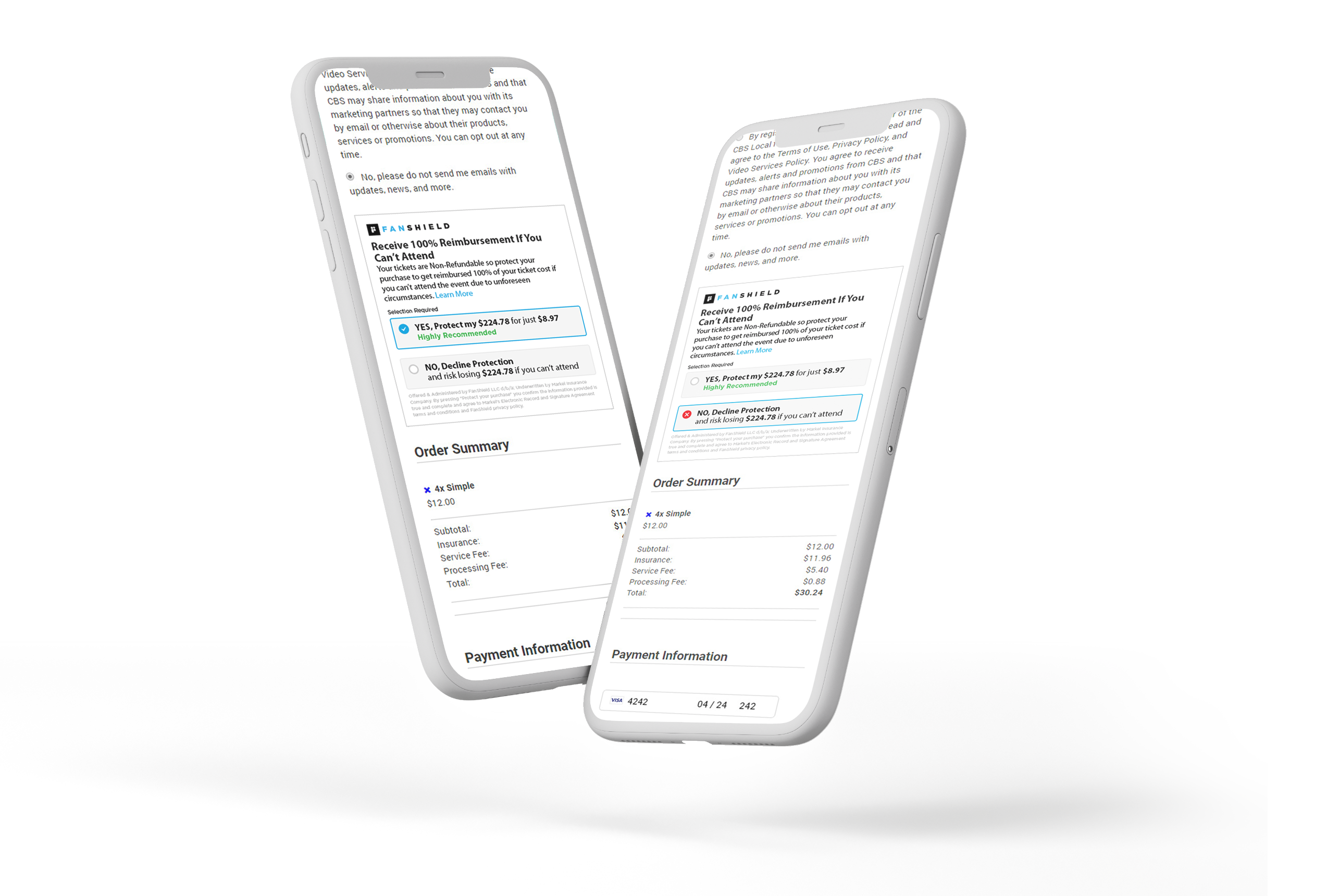
Upon entering this project, it was evident right away that the in-checkout widget needed an overhaul visually and aesthetically. My first task was to breakdown the current widget and determine the factors that may hinder positive conversion rates. From there I was able to pin-point these 4 major issues:
One of biggest concerns we received from our clients regarding the widget is its size. In order for our clients to maintain a fast and successful checkout process it was important to create a smaller widget to save space.
From user testing feedback I noticed that users ran into the issue of distinguishing between the accept and decline button.
The content within the widget needed updating to better inform users while minimizing the overall size.
The overall styling was outdated which didn't align well with most of our clients checkout ui. Also, the single cta with color feedback was too intrusive which could negativley effect conversions.
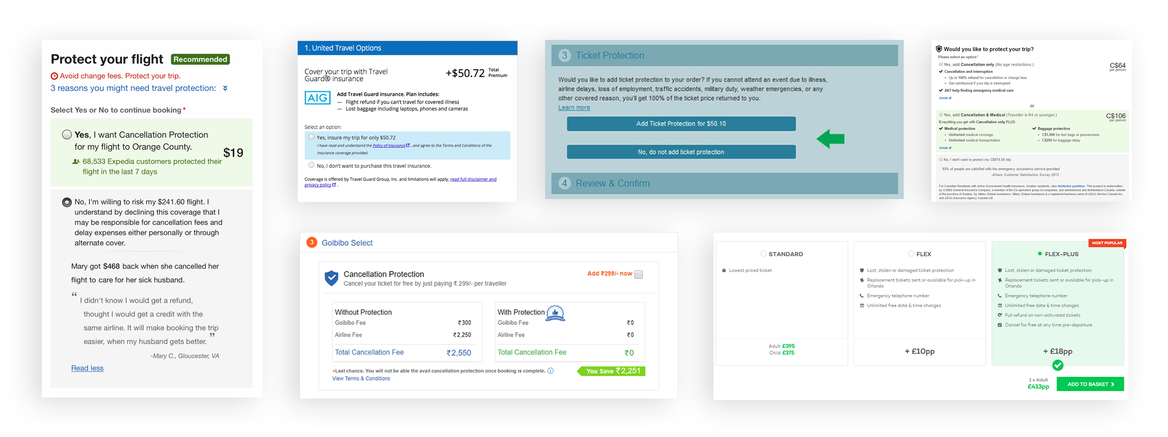
Part of my research consisted on doing some competitive analysis. So I was able to compile various insurance protection options that are currently live for various market. The key was to discover which elements are beneficial for contributing to the goal of increasing conversions.
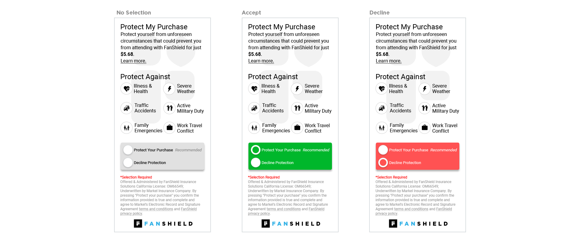
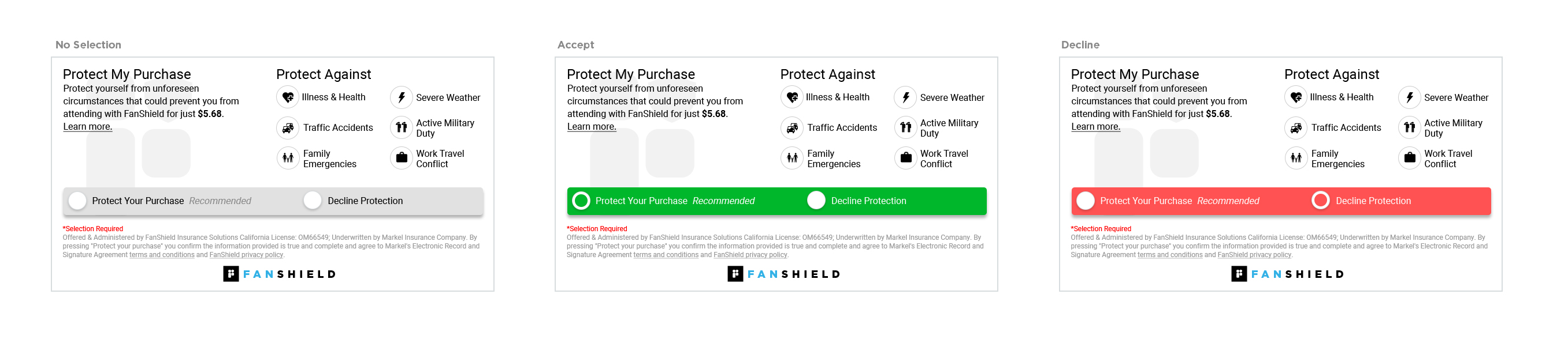
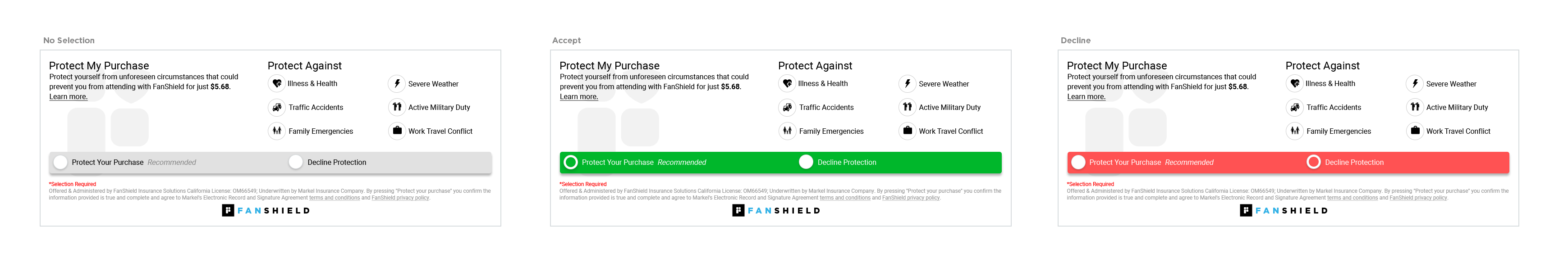
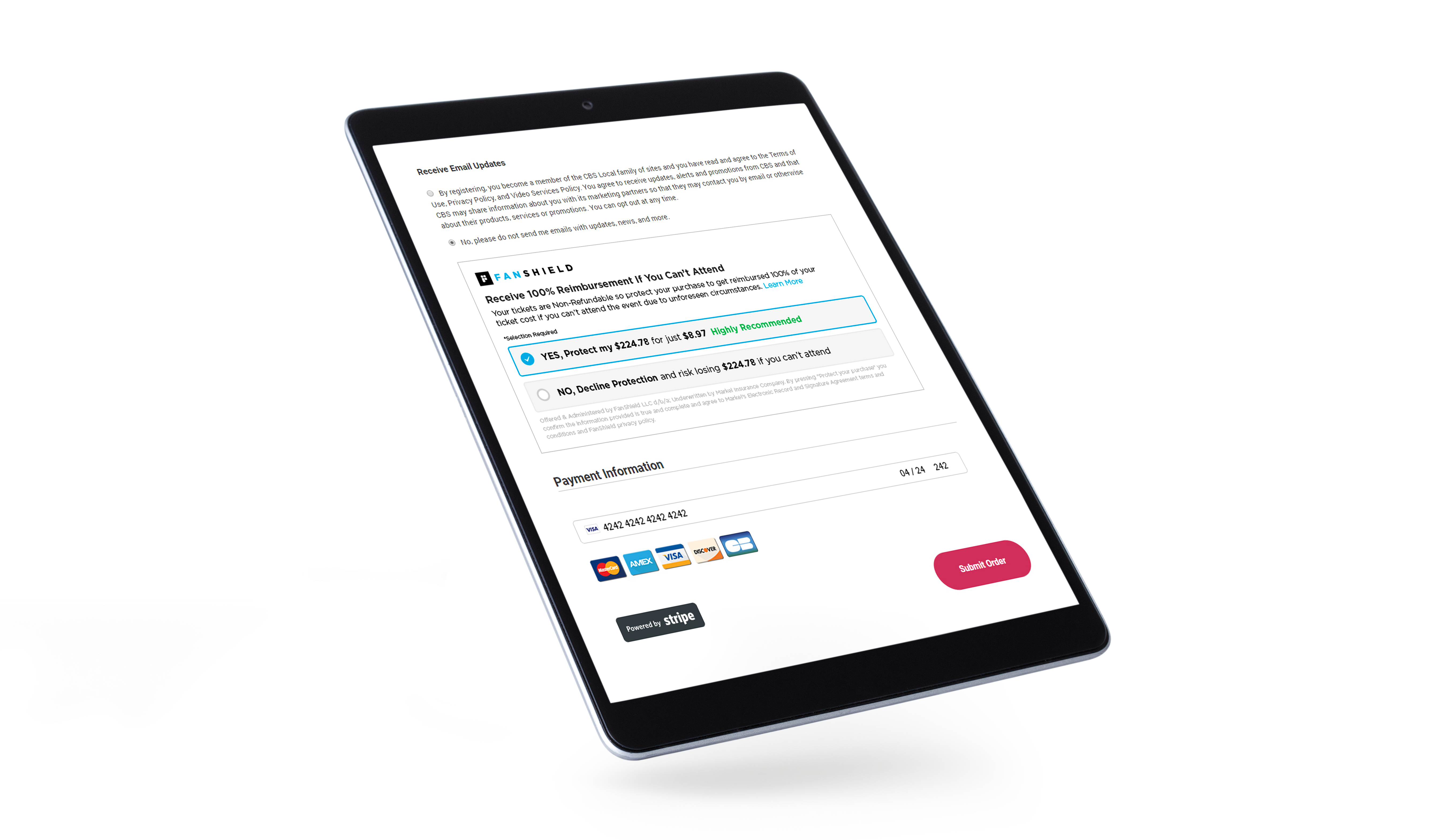
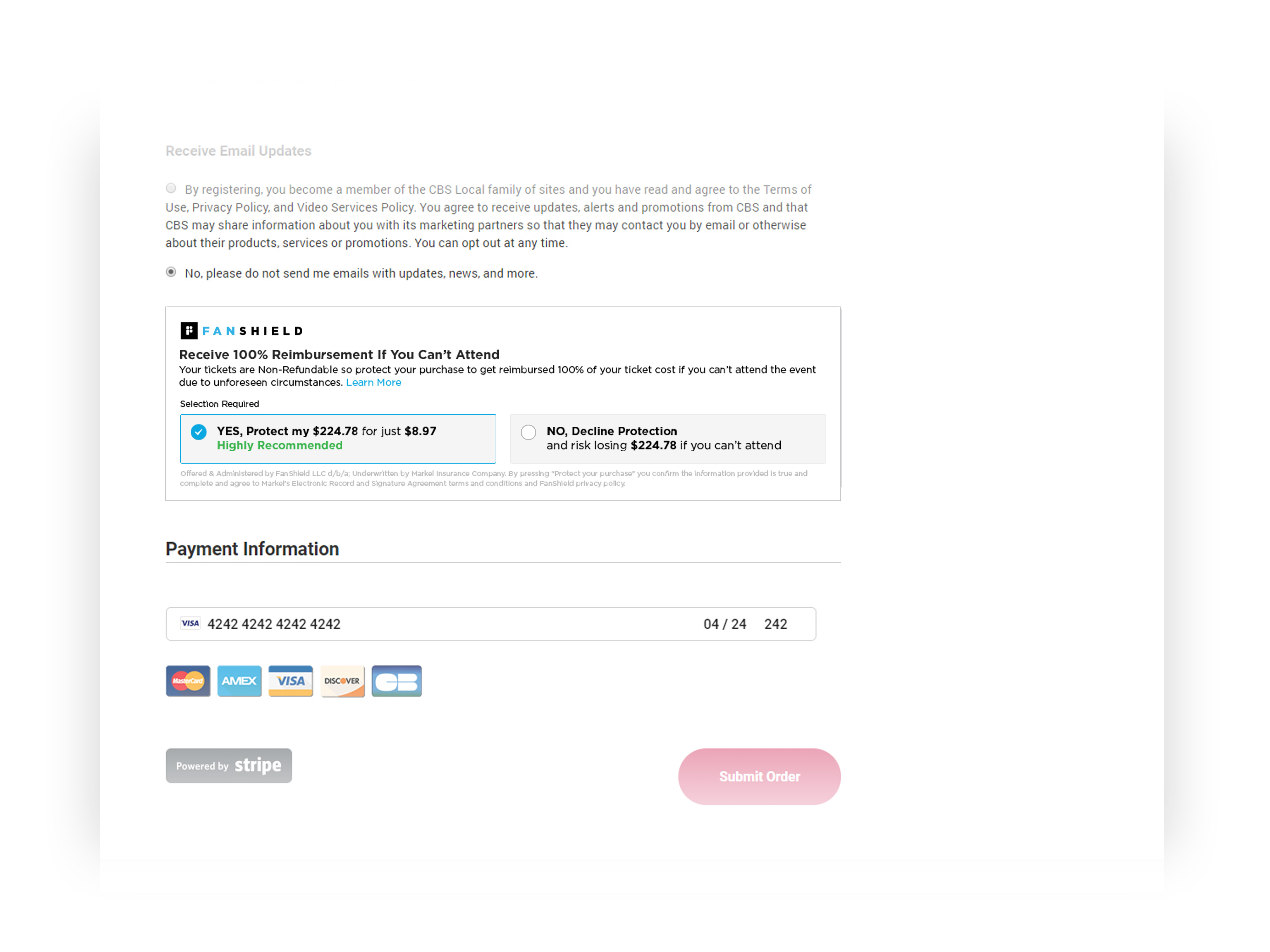
Determining high level content gave me the opportunity to remove uneccessary elements. This allowed me to remove and rearrange some elements of the widget which shortened the height and fit seemlessly within our clients checkout.
I separated the accept and decline cta to display two distinct buttons to make it easier for the user to make a selection. I also added clear visual feedback so the user knows what selection they have made.
Updated the content so that it is clear to the customer what you are protecting and that it's important for you to add this protection.
I created a design that has more of a current aesthetic style and can easily integrate with any client's website styleguide.
After creating the updated widget I led the efforts in putting together the A/B testing initiative. I created the documents that included testing the control against the updated variations and the significance calculator so we know how long the test should run and when we have reached our final results.
We were always challenged to try and come up with new ideas that can either improve our current widget or bring in other tech ideas that can increase conversion rates. Given my background with ux in ecommerce, I came up with an idea that can perfectly translate to our initiatives.
Our current widget only resides within our clients checkout so with that comes a few problems in terms of conversion. Given that our widget only resides in the checkout there are two major issues; our success is heavely reliant on our clients' site user experience and checkout flow, and about 90% of the sites traffic will never see the widget or have the option to purchase insurance.
In order to reach the millions of customers who don't get to the option to purchase insurance, I created the idea of placing a modified version of the widget within the product description page to reach customers earlier in their purchasing journey.
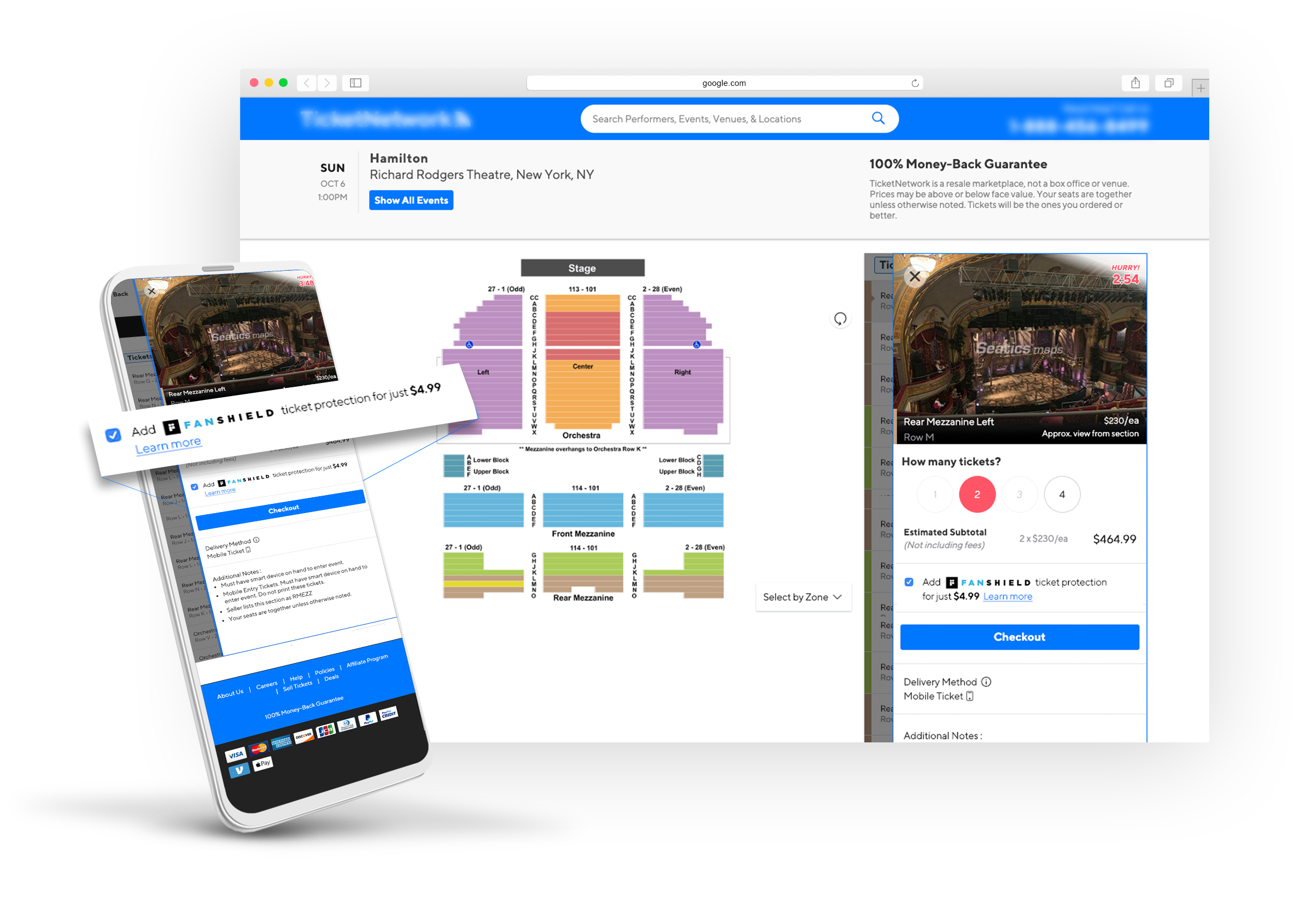
By connecting to the customer at an earlier stage of their purchasing journey we are able to increase impressions upwards of 1000%. Along with an increase in impressions, the customers now have more confidence in purchasing event tickets which translates into an increase in add-to-cart rates. With this new widget, overall insurance opt-ins and conversion rates will increase all around which improves our business and our clients goals.
Prev