Protecht, Inc. is a technology company committed to building a better experience in today’s online economy. With over 100 years of combined experience in fraud, risk, insurance, finance and payments, it's industry-leading technologies are powering their clients with financial and inventory control, security protocols, data analytics, customer engagement, and increased conversions.
Protecht's B2B clients require the access and use of a personal Dashboard in order to manage customer policies, claims, and orders. I was given the task to update an existing Dashboard and create a better user experience throughout the system.
I served as the UX lead of this project. I focused on user research and analysis, usability interviews, information architecture, wireframes, task flows, prototyping, and design. I worked along side the front and back end developers for development implementations.

Entering this project a design and framework had already been implemented but didn't have the ux background that was needed in order for it to be the most user friendly. I was able to go through the Dashboard and pin point the major issues that may affect our clients experience while using. Here are the major issues I discovered with the Dashboard after I was able to audit:
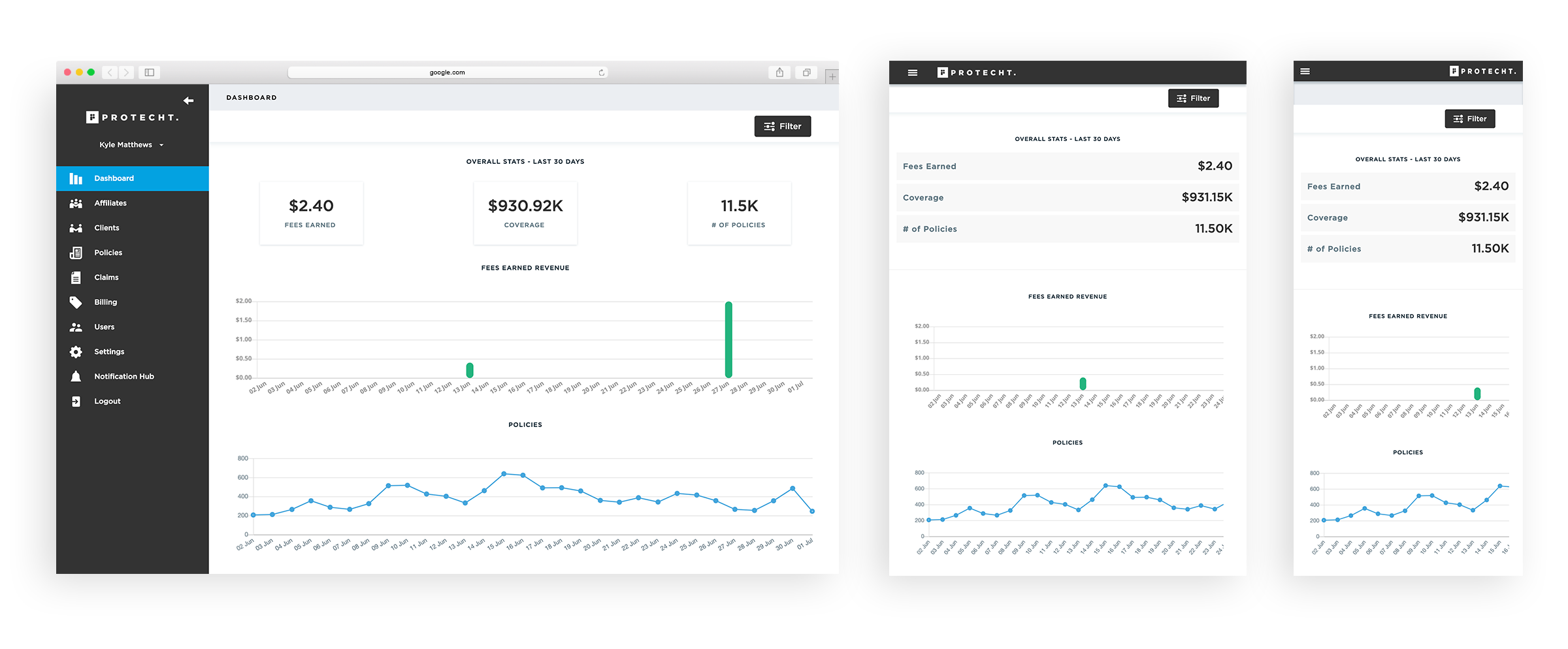
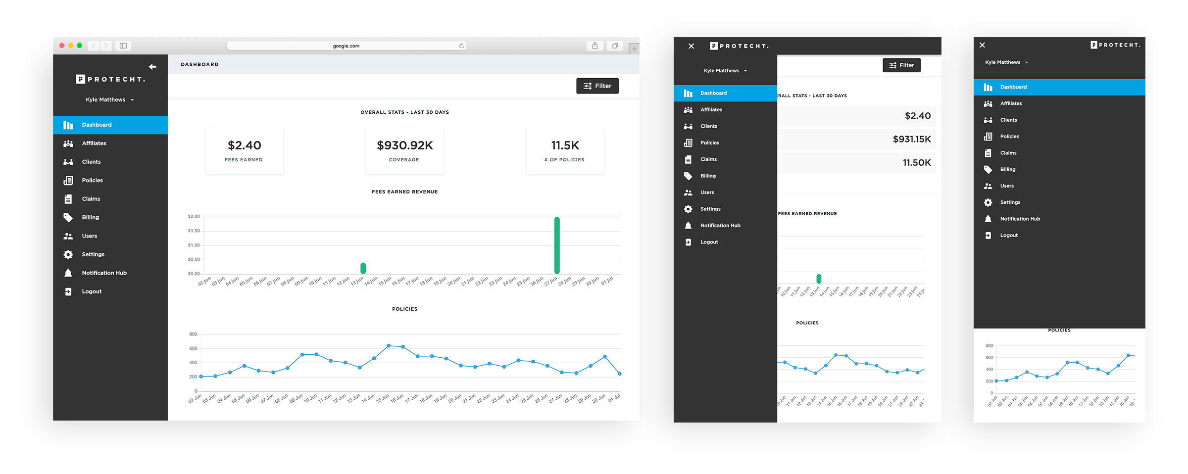
An inconsistent responsive design cause unfamiliarity and confusion for a custom when they use this Dashboard on various platforms. Some of those inconsistencies include the different locations of buttons and elements, hidden content, and menu functionality.
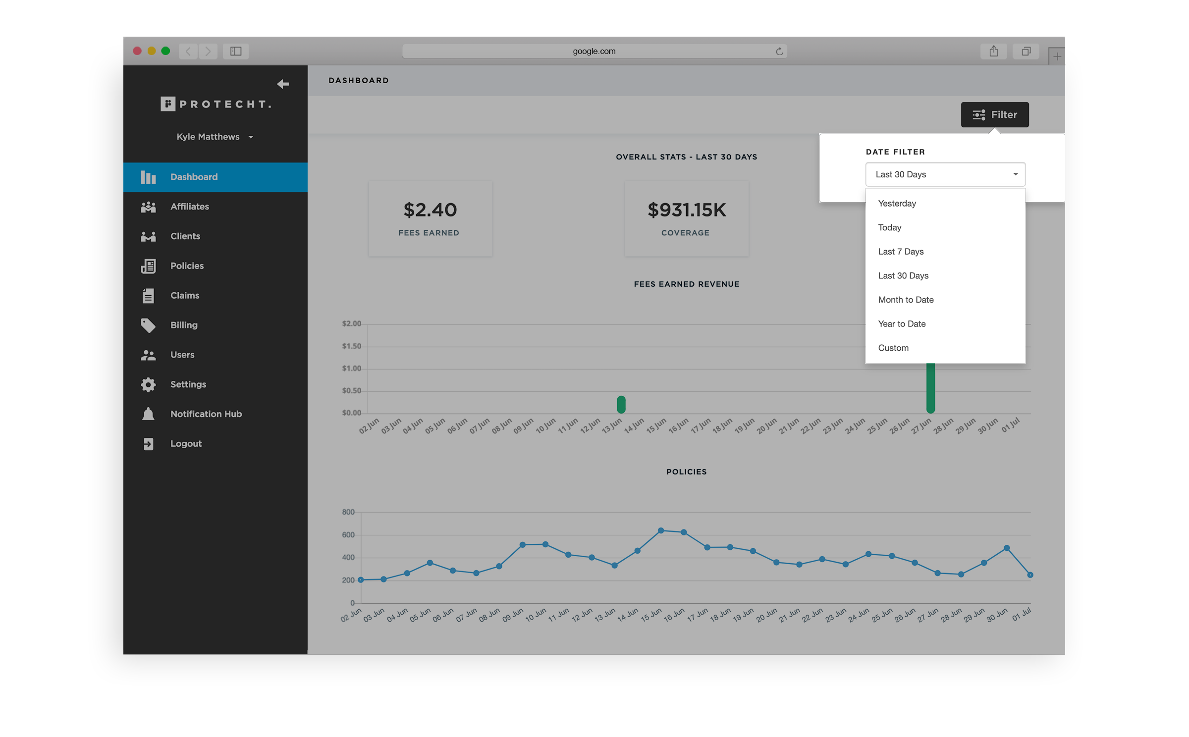
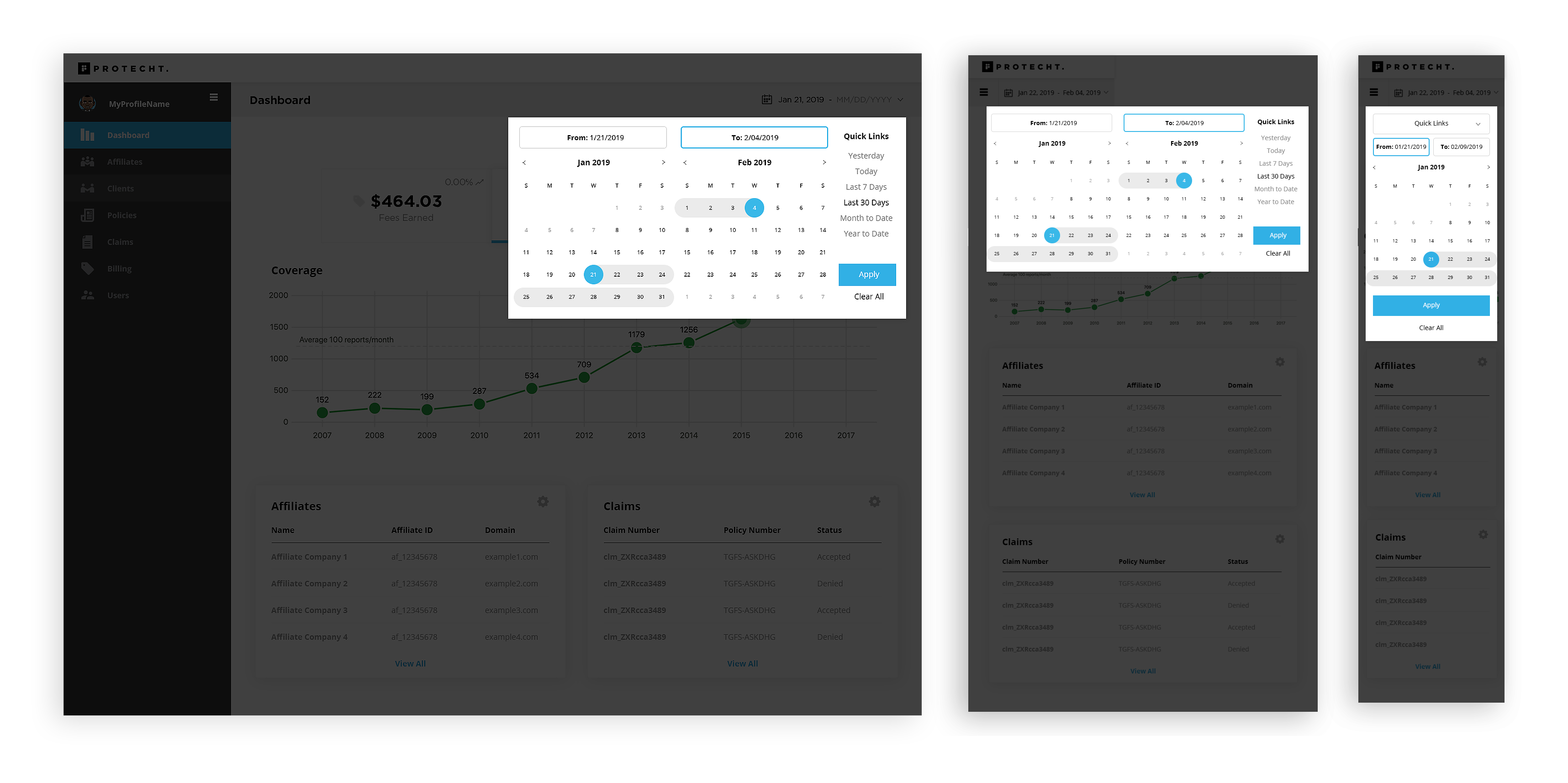
The date filter had major issues due to the numerous steps it took to complete certain tasks and the complexity of selecting date ranges.
When displaying the sidebar on various platforms there were minor inconsistencies along with a change in the header and framework
Since there already had been plenty of time and money spent on the first version of this Dashboard, I knew I couldn't redesign or restructure the framework too far from it's current version. So I set out to do capable changes that can improve the overall customer's experience and update the interface with various minor changes.
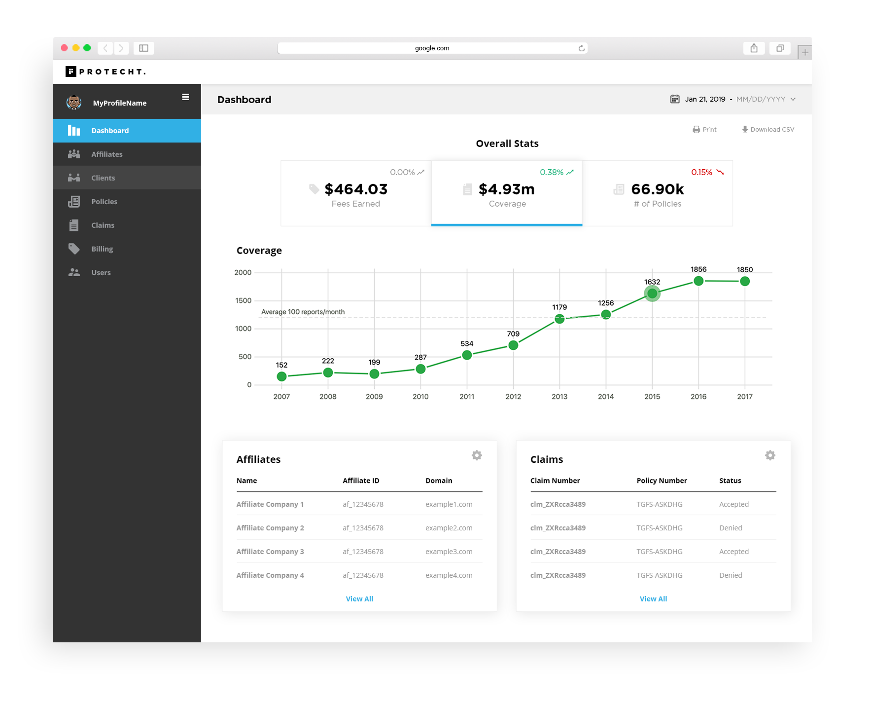
There were a few updates I wanted to include to the design that would give the client a better experience. Some of these updates included displaying hi-level table cards, consistent and recognizable icons, consistent headers and titles, and micro interactions.
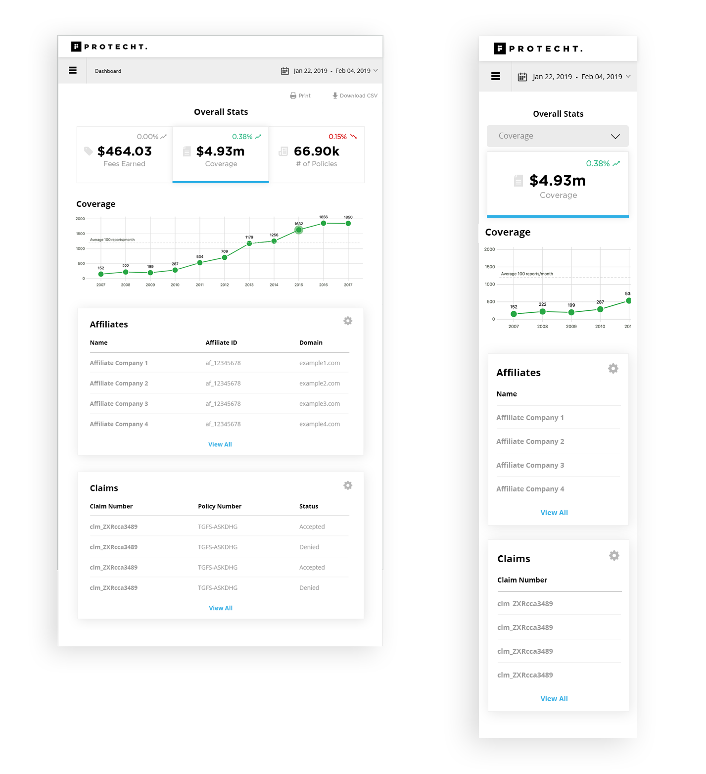
For the date filter I wanted to allow the user to make all of their options within one area. To do so I made sure to have the Quick Links and Calendar visible at all times so the user can easily make their selection. Another update that was made is making the selected date(s) visible at all times so the user always knows the timeframe for which the information is being displayed.
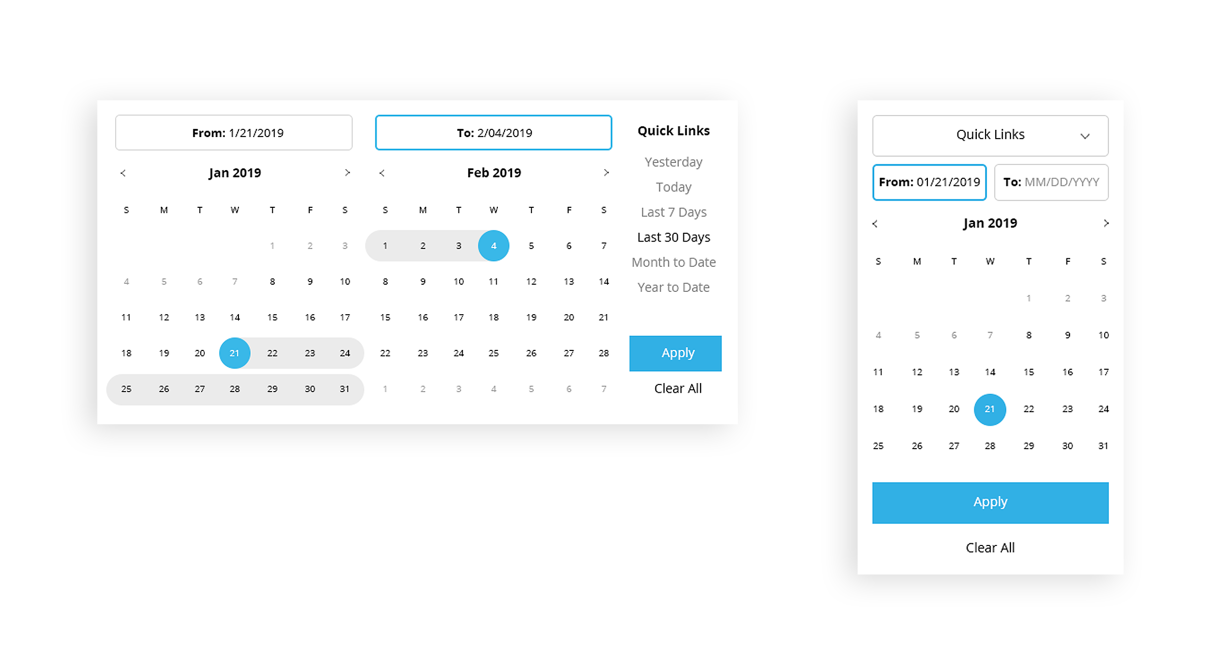
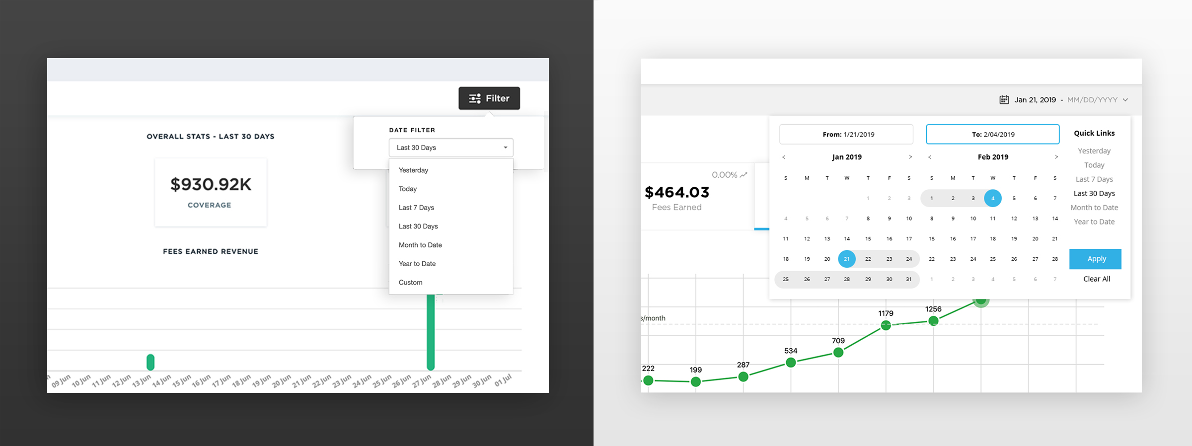
This new Date Filter is easily adjustable for responsive layouts with a key focus on a user friendly mobile experience. The Date Filter was created with mobile first ideation so the users experience stays consistent throughout all platforms.
Prev